Data & AI
The Mobile Dashboard Is the Wrong Tool
Why the constraints of mobile don't just demand better design — they demand a different interface entirely
Mar 2025 · 15 min
It is 02:17 on the North Sea. The Offshore Installation Manager (OIM) on a semi-submersible drilling rig has just been woken by an alert on their phone. The mud logger has flagged a pit volume gain — an increase in the volume of drilling fluid returning to surface that shouldn't be there — active for the past three hours. A gain that size, sustained that long, is a potential kick: formation fluid pushing into the wellbore. The driller on the floor has already reduced pump speed and done a flow check. The question of whether to initiate a well shut-in sits with the OIM. There is also an open permit-to-work entry from the evening shift that hasn't been closed out. And the morning crew change manifest is incomplete — the Persons on Board (POB) list needs to be finalised before the helicopter window opens at 06:00.
They open the operations dashboard.
What they get is a six-panel layout, three collapsed filter menus, a date range selector defaulting to the last thirty days, and a trend chart that requires two-finger zoom to read at this screen size. The legend is eight items long. The filters are 24 pixels wide. Somewhere in all of it is the answer to the question that woke them up. They spend ninety seconds trying to find it. They close the app.
The decision doesn't go away. The stakes don't go down. They just made a call on incomplete information, or they called someone who was also asleep, or they waited until morning.
This is not a story about a bad dashboard. The dashboard, in all likelihood, is a perfectly good dashboard. It was designed by capable people, tested with real users, and it works exactly as intended — on a 27-inch monitor, with a mouse, in an office, during business hours. The problem is not the dashboard. The problem is that we took an instrument built for one context and assumed it would serve a completely different one.
It won't. And the cost of that assumption, in operational environments where decisions carry real consequences, is not a UX inconvenience. It is a direct tax on the quality of decisions being made by the people responsible for making them.
Mobile isn't a smaller desktop
The conversation about mobile design has, for years, centred on the wrong problem. We treat mobile as a screen size constraint to be engineered around — responsive grids, collapsible navigation, touch-friendly tap targets. These are real problems worth solving. But solving them doesn't solve the deeper problem, because the deeper problem isn't dimensional. It's contextual.
Fitts's Law tells us that the time required to move to a target is a function of the distance to it and the size of it. On a device held in one hand on a moving vessel — or on a rig with ambient vibration, salt spray on the screen, and a Mustang suit restricting fine motor control — the interaction cost of a dense dashboard isn't friction. It's a wall. You cannot hover. You cannot right-click. You cannot make a precise selection with a fingertip on a 4px chart element.
But the physical constraints are only part of it.
Jakob's Law reminds us that users spend most of their time on other interfaces — and they bring expectations formed there. On mobile, those expectations have been shaped by apps that do one thing well: a message, a map, a status update, a single piece of information delivered in the context of a moment. The mental model a user brings to their phone is not "give me a complex analytical environment." It is "give me what I need right now."
Miller's Law — the finding that working memory can hold approximately seven chunks of information simultaneously — doesn't change based on device. But the conditions under which you're asking someone to process those chunks change enormously. The OIM who opened that dashboard is already doing their job — and doing it well. They have not stepped away from everything else to use it. They are already actively tracking the kick assessment, the flow check result, the driller's last update, the open permit-to-work, and the crew change window. That isn't cognitive overload. That is exactly what the role demands at 02:17 on a live well. The problem is that the dashboard was designed for someone with spare capacity to explore it. In this moment, every available slot in working memory is already doing something more important. The interface is asking for attention that the situation has already legitimately allocated elsewhere.
These are not responsive design problems. Adjusting the layout for a smaller screen cannot fix them. They are intent problems — mismatches between the cognitive mode the interface was designed for and the cognitive mode of the person using it in the field.
What dashboards were actually built for
I wrote previously about why dashboards are not for overview. The argument, briefly: the value of a dashboard is not the panoramic view it provides. It is the distance it collapses between raw data and a decision. A well-designed dashboard doesn't show you everything — it shows you what matters, in a format that makes the right action obvious faster than any alternative would.
On a desktop, with the right design decisions, a dashboard can do that job. The screen real estate supports multiple panels. The mouse supports precision interaction. The seated, focused user has the cognitive headroom to navigate, filter, and synthesise. The format and the context are aligned.
On mobile — particularly in operational environments where the stakes are high and the conditions are demanding — the format works against the job. The same goal. The wrong vehicle.
What makes this particularly insidious is that a responsive dashboard looks like a solution. It loads. It renders. The data is technically accessible. The checkbox gets ticked in the product backlog: mobile support: done. But making data accessible on a small screen is not the same as making it usable. And usable is not the same as useful. The OIM on that platform at 02:17 doesn't need access to the data. They need the answer the data contains — surfaced, prioritised, and delivered in a format that their context will allow them to act on.
Those are completely different design problems.
The constraint forces a better question
"How do we make this dashboard work on mobile?" is the wrong question. It accepts the dashboard as the answer and treats mobile as the constraint to be overcome. The right question is:
What does this person need from this data, right now, on this device, with these stakes?
This is the framing at the heart of the Jobs-to-be-Done framework — the idea that people don't use products, they hire them to do a job. Nudelman puts it plainly in UX for AI: don't ask users how they would use your AI product. Ask them what keeps them up at night. The answer to that question is the interface you should be building. The offshore OIM at 02:17 is not hiring a dashboard. They are hiring an answer. Specifically: what is wrong, how serious is it, and what do I need to do about it right now?
A dashboard — even a beautifully designed, fully responsive one — is built to shorten the distance between data and a decision. On mobile, at 02:17, on a live well, it cannot do that job. Not because the dashboard is wrong. Because the conditions the format requires don't exist in that moment. Hick's Law formalises what every operational decision-maker already knows intuitively: the more options you present, the longer it takes to decide. Every additional chart panel, every filter dropdown, every navigational element is a tax on a decision the situation demands be made quickly. The right tool, in the wrong context, becomes the wrong tool.
The constraint of mobile, then, is not a design problem to be managed. It is a forcing function. It demands you answer a question that desktop dashboards have allowed product teams to avoid: what does this person actually need, and what is the minimum viable interface that delivers it?
Enter the briefing layer
The most important design challenge in AI-powered products is not capability — it is trust and clarity. The question is not what the AI can do. It is what the user can understand, act on, and trust in the moment they need it. That framing reorients the entire design problem. You are not designing a feature. You are designing a moment of understanding.
The briefing layer is:
That moment of understanding, made into an interface pattern.
It is not a chatbot. It is not a search interface. It is not a summary tab bolted onto a dashboard. It is a fundamentally different entry point to the same underlying data — one that puts synthesis before exploration, action before analysis, and the user's context before the system's structure.
But that reordering of priorities carries its own weight. When a system synthesises before it shows, the quality of that synthesis becomes load-bearing. An AI briefing layer that surfaces the wrong priority, misreads a trend, or omits a critical signal isn't just unhelpful — in an operational environment, it is actively dangerous. The trust that makes the format work is not given freely. It is earned through data quality, model accuracy, and transparent reasoning. The OIM who acts on a briefing they cannot verify is extending trust to a system that must deserve it. This is why the human in the loop is not an optional feature of the briefing layer — it is the point of it. The AI reads the data. The human makes the decision. That division of responsibility is not a limitation of the technology. It is the design intent. A briefing layer that removes the human from the decision is not a better interface. It is a different — and far more dangerous — product entirely.
What the data foundation needs to look like to support a briefing layer reliably — consistent definitions, governed sources, understood limitations — is a separate problem, and not a small one. But it is the prerequisite that makes everything else possible. An AI that briefs confidently from ungoverned data is not a briefing layer. It is a liability dressed as a feature.
Where a dashboard surfaces data and nudges the user toward the conclusions it contains, the briefing layer brings those conclusions forward — presenting not just what the data shows, but what it means for the decision at hand. The data is still there. The charts still exist. Progressive disclosure — the UX principle of revealing complexity only when the user asks for it — means the full dashboard remains accessible for those who need it. But it is no longer the first thing. It is the thing you reach for when you need more than the briefing can give you.
Don Norman introduced the concept of the Gulf of Evaluation in The Design of Everyday Things — the gap between the state of a system and what a user can perceive and understand about it. Every offshore OIM who has opened a mobile dashboard and closed it without acting has fallen into that gulf. The system held the answer. The interface did not communicate it in a form the user could act on.
The briefing layer closes that gulf.
The briefing layer is graceful guidance made concrete. It doesn't show its working unless asked. It surfaces the signal, not the noise. It trusts the user to be capable of the decision while removing the burden of excavating the data to get there.
What the briefing layer looks like depends on who is receiving it:
The OIM gets a ranked action list. Three items, ordered by urgency. Each one a single sentence of context. Each one tappable for the detail they need to act.
The driller on the floor gets a single focused view — the one reading that determines their next move. Current pit volume, pump rate, and flow check status, with a clear indicator of whether the numbers are inside or outside the well programme's defined limits. No trend history unless they ask for it. No comparative data from other wells. The one number that tells them whether to hold, adjust, or call the OIM.
The underlying data hasn't changed. The charts are still there for the people who need them, in the contexts where exploration is the job. The briefing layer doesn't replace the dashboard. It replaces the dashboard as the entry point — and in doing so, it gives every user the interface that matches their context rather than the one that was easiest to build.
What it looks like in practice
The argument above is easy to accept in the abstract. What makes it real is the difference between the two interfaces side by side. Here is that difference, made concrete.
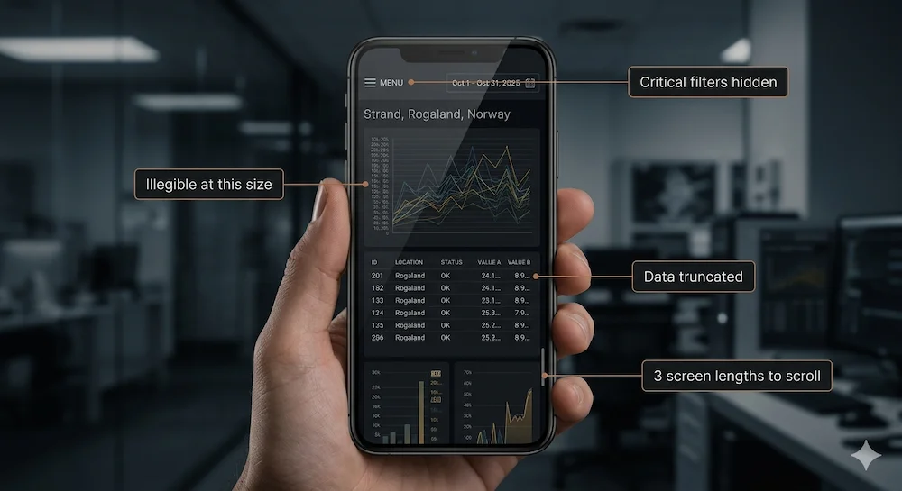
A typical operational dashboard rendered at mobile width. Six panels, each containing a chart or table designed for a desktop viewport. Finding the relevant information requires scrolling through the equivalent of three screen lengths — past panels that aren't relevant to the immediate situation, back up to cross-reference a value seen two panels ago, down again to check a related metric. The filter bar has collapsed into a hamburger menu. The trend chart is 180 pixels wide — the Y-axis labels are illegible, the data points indistinguishable. The vessel status table has truncated three of its five columns. The date range selector requires precise tap interaction on a 28-pixel target.
Everything the user needs is somewhere in here. The back-and-forth required to piece it together — scrolling, zooming, navigating, remembering — is the interface asking the user to do the cognitive work that the design should have done for them.
The labelled failure points are not bugs. They are the predictable consequence of taking an interface designed for one context and forcing it to serve a completely different one. The development team built exactly what they were asked to build. The problem was never the implementation. It was the assumption that making something technically accessible on a smaller screen is the same as designing for the person holding it.
What the AI sees in the same moment is not a dashboard at all. It is a pattern — three signals degrading across the same shift window, each individually unremarkable, together telling a single story.
Three signals. One window. A pattern that only becomes visible when you read across all three data sources simultaneously — which is exactly what a rules engine cannot do, and exactly what AI can.
The briefing layer in action
The same underlying data. A different entry point. Every item drawn directly from the situation that woke the OIM up — not a generalised operational summary, but a precise answer to the question the moment is actually asking.
Three layers. One decision. The briefing surfaces what matters. Tapping an item reveals the data summary and two immediate actions — act now, or escalate. The drill-down is a third tap away for the OIM who wants to see the underlying trend before deciding. Each layer is a deliberate choice, not a forced starting point.
The briefing layer in this example could be built with AI, but it doesn't have to be. A sufficiently well-designed rules engine, a priority algorithm, and a structured data layer could produce something that looks similar. Nudelman calls this the best AI is no AI principle — if a well-designed rules engine can do the job reliably, that is the right tool. AI earns its place only where deterministic alternatives cannot go. The best AI feature is often the one the user never notices — not because it is hidden, but because it is so well integrated into the experience that it feels like the product simply working as it should.
Where AI earns its place in a briefing layer is in the synthesis. Rules engines are good at surfaces — they can flag when a value crosses a threshold. AI is good at context — it can recognise that three individually unremarkable signals, taken together, constitute a pattern worth surfacing. The pit volume gain in this example is not remarkable on its own. Combined with the open permit-to-work and the incomplete POB list, it tells a story about a shift handover that has gone wrong in three simultaneous ways — and that story only becomes visible when you read across all three data sources at once.
There is a second capability worth naming. The chart the OIM sees when they tap "View pit volume trend" was not hardcoded. It was generated on demand from the underlying data, shaped by what the AI determined was relevant to this specific alert, at this specific moment. This matters because operational data environments are complex and unpredictable — no engineering team can anticipate every chart a user will need before they need it. A briefing layer backed by AI can generate purpose-built visualisations dynamically, pulling from whichever data sources are relevant to the situation at hand. The alternative — attempting to pre-build every possible chart and surface the right one — is both brittle and expensive. Dynamic generation keeps the analytical layer agile.
And yes — a conversational layer can augment this. The OIM who wants to ask "what happened to the pressure readings on Well 34/7-A in the last 72 hours?" should be able to. A well-designed briefing layer is not a replacement for conversational AI — it is the entry point. The briefing surfaces what matters. The conversation handles what the briefing cannot anticipate. Together they close the distance between the data and the decision more completely than either does alone.
What you just saw in that final step — the AI flagging the incoming OIM and updating the crew change manifest without the OIM navigating to do it themselves — is the earliest form of agentic behaviour. Not autonomous. Not self-directed. But acting in the world on a human instruction, across system boundaries, in a single step. That is where the briefing layer ends and something more consequential begins.
The conversation doesn't replace the briefing. It extends it — handling what the briefing couldn't anticipate, without requiring the OIM to navigate a dashboard to get there. That is a fundamentally different relationship between the user and the data. And a fundamentally different design assumption about what the interface owes the person holding it.
The importance and value of designing AI outputs that match the user's decision horizon cannot be ignored — the timescale and scope within which they need to act. At 02:17 on an offshore platform, the decision horizon is immediate and narrow. One alert. One decision. One action. That is the interface the moment requires, and it is the interface the briefing layer delivers.
Beyond mobile — and what this means for how you build
The briefing layer principle does not stop at the edge of a phone screen.
Every argument made above about the offshore OIM applies equally to the executive reviewing overnight numbers on a tablet before a board meeting. To the plant manager doing a morning walkthrough with one eye on their phone. To anyone whose role requires decisions rather than analysis, and whose context at the moment of access is time-constrained, high-stakes, and intolerant of friction.
Mobile makes the failure impossible to ignore because the constraints are too severe to paper over. A small screen, unreliable connectivity, and one-handed interaction in demanding physical conditions strip away every margin for poor design. But the underlying problem — an interface built for exploration being handed to someone who needs an answer — exists wherever the user's context and the dashboard's assumptions don't match.
The reason mobile forces the issue is precisely because it is unforgiving. Desktop design can tolerate a certain amount of complexity and still function. A power user can navigate a dense dashboard. A trained analyst can extract insight from a wall of charts. But on mobile, in the field, under operational pressure, that tolerance goes to zero. The interface has to be right, or it doesn't get used. And an interface that doesn't get used in a high-stakes operational context is not just a failed product. It is a gap in the decision-making infrastructure of the organisation.
This is why the design question is not "how do we make our dashboard mobile-friendly?" It is a more fundamental question about what kind of tool you are building and for whom.
If you are building for analysts who need to explore data, investigate anomalies, and construct their own understanding — build them a great customisable dashboard and make sure it works well on the devices they actually use for that work. That is almost certainly a desktop or a large tablet.
If you are building for decision-makers who need answers, not exploration — build them a briefing layer. Give the AI the job of reading the data so the human can spend their cognitive energy on the decision rather than the excavation. The AI's job is to reduce the cognitive burden of getting to the point of decision, not to showcase what it can compute.
If you are building for both — and most operational data products serve both — build both, and be honest about which one is the entry point on which device. The dashboard and the briefing layer are not competitors. They are different interfaces serving different jobs in different contexts, drawing on the same underlying data.
The mistake is not building dashboards. The mistake is assuming that a responsive version of a dashboard is the same as designing for the context in which it will actually be used.
This is not an argument for replacing dashboards. It is an argument for being deliberate about when they are the right tool and when they are not.
The dashboard earns its place in the moments that require depth — when an engineer needs to understand why an anomaly occurred, when an analyst needs to trace a pattern across weeks of operational data, when a team needs to build a shared picture of what is happening across an asset. That work is investigative, unhurried, and screen-dependent. The dashboard is the right instrument for it.
The briefing layer earns its place in the moments that require speed — when a decision cannot wait, when the context demands action over analysis, when the user is already carrying the weight of an operational situation and needs the data to meet them where they are rather than requiring them to come looking for it.
These are not competing interfaces. They are complementary ones, drawing on the same data, serving different moments in the same operational reality. The failure is not building dashboards — it is assuming that a responsive version of a dashboard covers both moments, and discovering, at 02:17 on a live well, that it does not.
Start with the person. The decision they need to make. The context they're in when they need to make it. The device in their hand. The stakes attached to getting it right.
Then design the interface that serves that moment — not the interface that was easiest to build, or the interface that showcases the depth of your data, or the interface that ticked the mobile support checkbox in the backlog.
The offshore OIM at 02:17 doesn't need a dashboard. They need an answer. Building the thing that gives them that answer, reliably and quickly, in the conditions they're actually operating in — that is the design problem worth solving.
Greg Nudelman's The UX for AI is a practical framework for designing effective human-AI experiences — grounded, specific, and directly applicable to product work. The chapters on Digital Twins and the Value Matrix have particular relevance if you work at the intersection of operational data and AI.
This article is a companion piece to Dashboards Are Not For Overview. If the argument above resonated, that one sets up the design philosophy that this one builds on.
The right problem.
The right partnership.
Open to the right full-time leadership roles and consulting partnerships. If the problem sits at the intersection of design, data, and technology — let's talk.